

HEALTHCARE ADVERTISING GUIDE
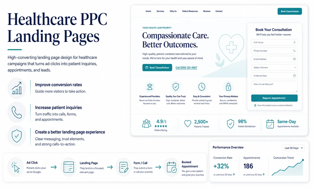
A healthcare campaign can target the right keyword, write a strong ad, and still lose the patient after the click. The landing page is where interest becomes an appointment request, and it is often the weakest part of the funnel.
An effective healthcare advertising strategy does not send every visitor to a general homepage. It gives each patient a page that matches the service they searched for, answers the questions delaying action, and makes the next step easy on a phone.
This guide explains how to build healthcare landing pages that support both patient trust and measurable Google Ads performance.
What This Post Covers
- Matching the page to patient intent
- Building trust without overwhelming visitors
- Using clear calls to action
- Designing forms for mobile users
- Handling pricing and insurance questions
- Connecting landing pages to conversion tracking
1. Continue the Conversation Started by the Search
Every search contains an implied question. A patient searching for an emergency dentist wants immediate availability. Someone searching for a knee replacement consultation wants expertise, insurance information, and a clear evaluation process.
The landing page should answer that specific question. Repeating a broad headline such as “Compassionate Care for Every Patient” does not confirm that the practice offers the service, has a nearby location, or can schedule the appointment.
Use the service name in the headline, explain who the page is for, and state the next step near the top. Message alignment reduces confusion and helps qualified visitors act faster.
Question to Answer: Does the first screen of the page confirm the exact service the patient searched for?
2. Use One Primary Action
Healthcare pages often present too many choices: call, request information, download a guide, find a doctor, search locations, join a newsletter, and browse patient resources. Every option competes with the appointment request.
Choose one primary action based on the service. High-urgency care may prioritize a phone call. Elective procedures may use a consultation request. Established patient services may direct users to online scheduling.
Secondary actions can remain available, but the design should make the preferred step obvious. Button text should describe the action, such as “Request an Evaluation” or “Call for Same-Day Availability.”
Question to Answer: What is the single action a qualified visitor should take on this page?
3. Put Essential Information Above the Fold
Patients should not have to scroll through a long introduction before learning whether the practice can help them. The top of the page should contain the service, location, primary benefit, and appointment action.
Include a mobile click-to-call number, a short explanation of the service, and relevant availability when it is accurate. For location-specific campaigns, show the city or office near the top.
This does not mean cramming every detail into the first screen. It means removing the uncertainty that causes a patient to return to Google and click another result.
Question to Answer: Can a mobile visitor understand the offer and act within ten seconds?
4. Build Trust With Specific Evidence
Healthcare decisions require trust, but generic claims do not create it. “Experienced providers” and “patient-centered care” appear on nearly every medical website.
Use evidence that a patient can evaluate: provider names and credentials, years of relevant experience, board certifications, hospital affiliations, review volume, accepted insurance, and services available at that location.
For procedure-focused pages, explain the evaluation process and what happens at the first appointment. Clear expectations reduce anxiety and improve lead quality because patients understand what they are requesting.
Question to Answer: Which three facts prove that this practice is qualified for the service being advertised?
5. Keep Forms Short and Useful
Long healthcare forms reduce submissions, especially on mobile devices. A paid-search landing page usually needs only enough information to begin the scheduling process.
Name, phone number, email address, preferred location, and a general appointment preference are often sufficient. Avoid requesting detailed clinical information unless it is necessary and the form, systems, vendors, and data handling have been reviewed appropriately.
Every additional field should have a clear operational purpose. If the front desk never uses the answer, remove the question. A shorter form can improve completion rates and reduce the amount of sensitive information collected at the advertising stage.
Question to Answer: Which form fields are truly required before a staff member contacts the patient?
6. Answer Pricing and Insurance Questions Carefully
Patients frequently compare providers based on insurance participation, expected costs, financing, and payment options. Hiding all financial information behind “contact us” can reduce trust and generate unqualified leads.
List accepted insurance plans when the information can be maintained accurately. For self-pay services, explain consultation fees, starting prices, ranges, or financing options when appropriate. Add a clear note that final costs depend on evaluation and coverage.
The goal is not to quote a final medical bill on the landing page. It is to give patients enough information to decide whether contacting the practice makes sense.
Question to Answer: What financial question prevents qualified patients from requesting an appointment?
7. Create Separate Pages for Separate Locations
Multi-location practices should not make paid-search visitors choose an office after the click. A location campaign should lead to a page with the correct address, phone number, providers, hours, parking information, and map.
Location-specific proof is valuable. Mention the services actually available at that office, nearby landmarks, language capabilities, and scheduling options. Do not promise same-day care at a location that cannot provide it.
Dedicated location pages also make call tracking and appointment attribution easier. The practice can see which office received the lead instead of relying on a generic contact form.
Question to Answer: Does each advertised location have a complete and accurate landing page?
8. Design for the Real Mobile Experience
Most landing-page reviews happen on a desktop screen, even though many patients arrive on mobile devices. Test the page on an actual phone using cellular data, not only a fast office connection.
Check load speed, font size, button spacing, form behavior, click-to-call functionality, and whether important content is covered by pop-ups or chat widgets. The phone number and appointment button should remain easy to use without accidental clicks.
Complete the full conversion path yourself. If requesting an appointment is frustrating for someone who knows exactly what to do, it will be worse for a patient who is uncertain or in pain.
Question to Answer: Can a patient complete the primary action in less than one minute on a phone?
9. Track the Page Beyond the Form Submission
A landing page should be evaluated by qualified appointments, not only conversion rate. A page that produces many low-quality inquiries may look successful in Google Ads while creating more work for the practice.
Track calls and forms separately, record the landing page and service in the practice workflow, and measure how many leads become scheduled and completed appointments. Review lead quality with the front desk rather than relying only on analytics.
Use this feedback to improve the page. If patients repeatedly ask whether a service is covered by insurance, address that question. If leads expect a treatment the office does not provide, clarify the page and keywords.
Question to Answer: Which landing pages produce the highest percentage of booked appointments?
In Summary
Healthcare landing pages should reduce uncertainty. Match the search, show the correct service and location, establish trust with specific evidence, and give the patient one clear next step.
Keep forms short, answer practical questions, and test every page on a phone. Most importantly, measure performance through booked appointments rather than form submissions alone.
